Blog: Poorly Executed Logos and Brands Ruin Gear
Sometimes being a designer is a curse. For instance, I am a huge sports fan and want to support certain teams, but when they have logos/brands that aren’t executed well it is difficult for me to wear their gear.
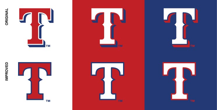
The Texas Rangers have long been a dilemma for me. I LOVE the name, so perfect, and the red, white, and blue colors perfectly match the very cool Texas state flag. The big T logo is great too, fits the Texas vibe, and is well designed. But then they completely ruin it, in my opinion, by adding an outline AND a drop shadow. Cluttering a very nice form. WHY?! I’m always on the lookout for a cap I can wear that doesn’t include the drop shadow (as is shown above) but to no avail. So it’s a team that’s hard to support by wearing their gear.
Another example was the San Diego Padres. It was the team I grew up with and they hold a very special place in my heart. But for years they insisted on using navy blue and orange or sand instead of their historic brown and yellow. Even though the SD mark on a the hat was well done, I could not bring myself to wear any blue Padres gear as it was a complete swing and a miss for their mascot. Fortunately a few years back the team FINALLY brought back the brown/yellow and I immediately went out and bought a new cap!
All in all there are many great team logos/brands but the ones that are problematic tend to be over designed and cluttered. As designers we know that double and triple outlines and drop shadows are generally a sign that the look isn’t working and no matter how many bells and whistles you add it’s not going to fix it. The lesson to sports designers, keep it clean, simple, classic.
— Hovie Hawk
< Back to Blog