Blog: Pizza Hut's New Logo
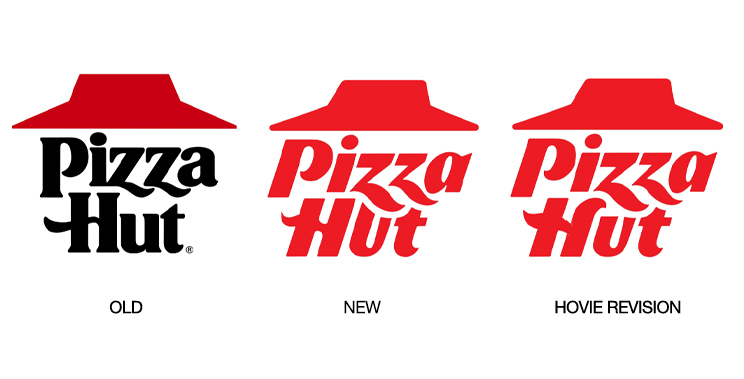
Recently Pizza Hut became the latest highly visible company to rebrand. Although not to the point of The Cracker Barrel controversy, to me the logo is a downgrade from their iconic look. I read that they, like many, are losing market share and thought a new look could help improve sales. Unfortunately the only thing it says to me is they are fast and connected somehow (thanks to the eye or a fellow designer friend) to Hot Wheels? It says nothing about pizza or quality or a good time.
As someone who grew up having a fun time with friends and family at Pizza Hut, I probably haven’t actually eaten there for 4 years, due mainly to their pizza simply not tasting good anymore. It was cardboard-like and really lacking in flavor. When a less expensive frozen pizza from the grocery store is outshining you, maybe it’s not the logo but rather the product.
Still, if they have a good reason for thinking that a fast motif is what will change their current trajectory, I would submit that they stopped short of even that goal. With a few typographic tweaks I feel the logo would be better as a mark. By fixing the odd U in Hut and adding the swoosh element seen on the Z forms to the right ascender of the H, the word mark flows much better and appears more cohesive. Now that still doesn’t address the aspects of pizza or taste but at least it’d convey a bit more polish and quality which I feel is really the basis for the company’s tough times as of late.
— Hovie Hawk
< Back to Blog